Escursì

A system-first identity for a brand rooted in local culture, designed to be used, adapted, and owned.
Escursì approached me to refresh an outdated visual identity with two non-negotiable constraints: retaining the existing logotype and the brand’s signature yellow. Rather than treating these as limitations, I proposed to shift the identity away from a logo-centric approach toward a scalable, system-driven visual language.
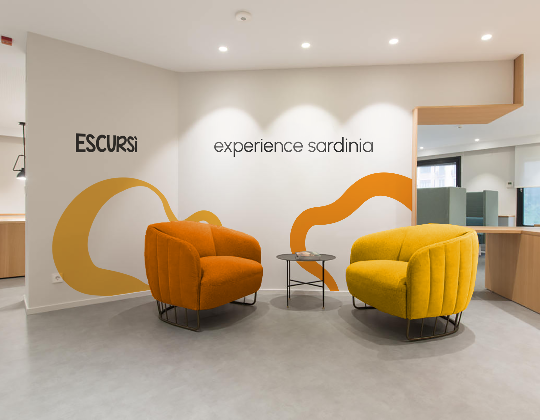
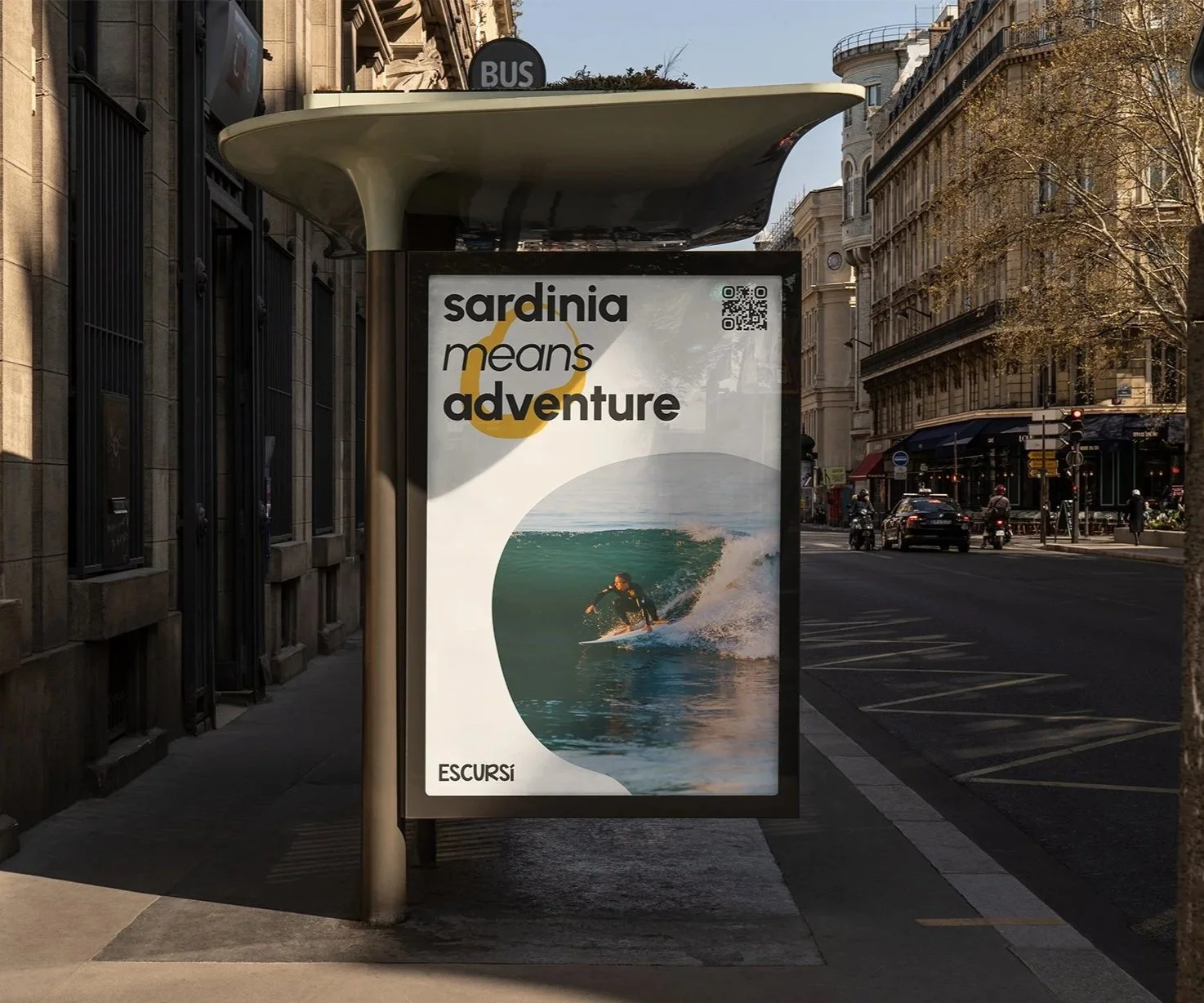
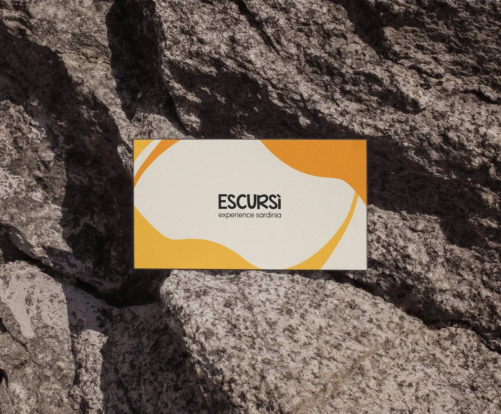
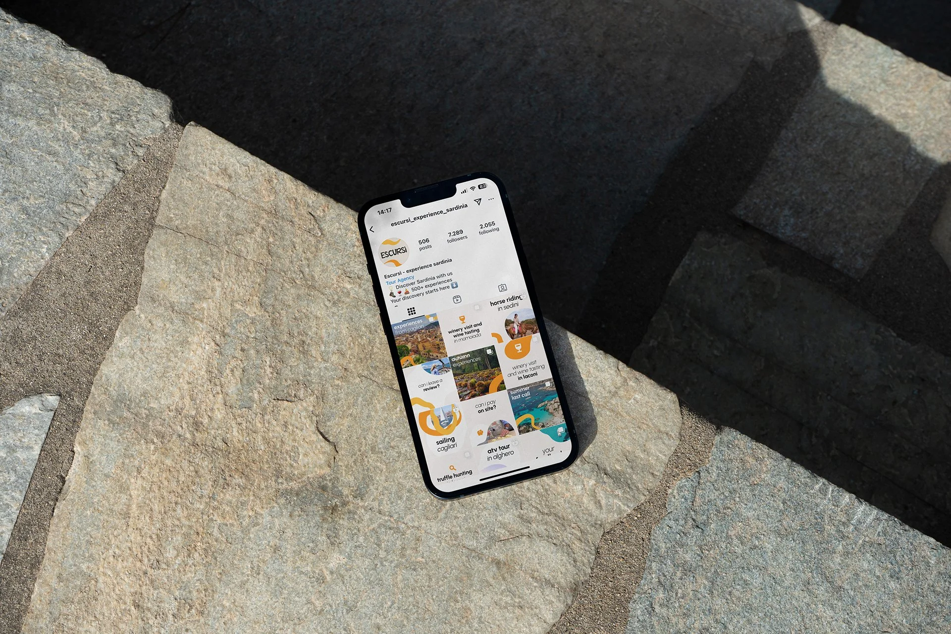
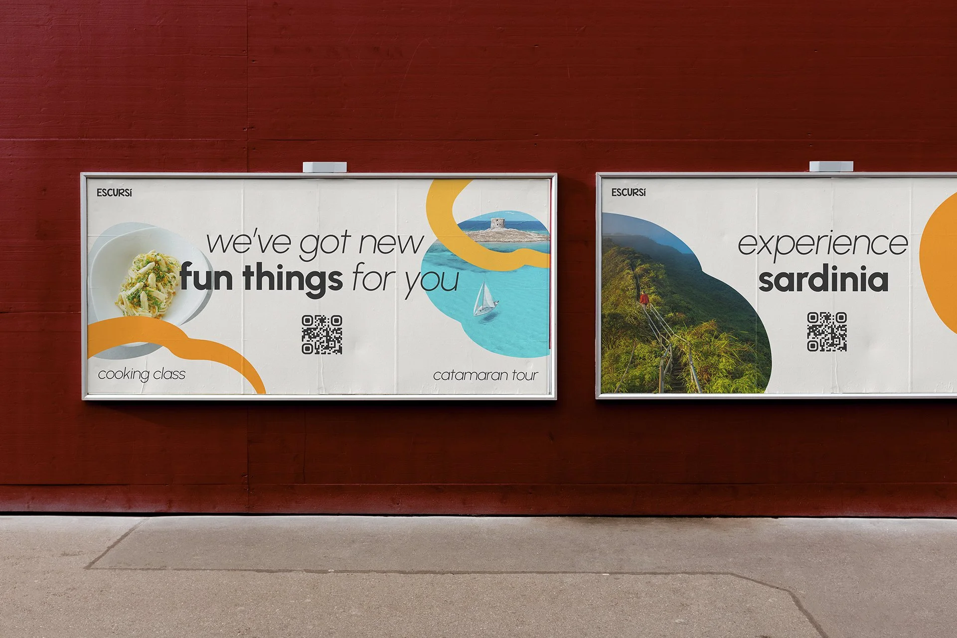
The core of my approach was to design a recognizable while flexible identity capable of adapting across formats, experiences, and audiences, while remaining deeply rooted in Sardinia’s maritime and culinary culture. At the heart of the system are fluid, modular shapes inspired by squids: a playful yet meaningful reference to local heritage and the sense of exploration at the center of the Escursì experience.
These elements act as dynamic building blocks, varying in scale, rhythm, and composition to create movement and visual diversity. The system is designed to perform consistently across digital, print, and spatial touchpoints, allowing the brand to evolve without losing coherence.
To make sure scalability was owned by the brand in the long term, I empowered the clients with tools and training sessions to make sure the system was put to good use. The result is a future-proof identity built for longevity, consistency, and growth beyond static brand assets.
A successful rebrand doesn’t end with a strong visual identity or a brand book: it only succeeds when the client can confidently apply it over time. As part of the Escursì rebranding package, I focused on empowering the internal team with tools, documentation, templates and ongoing support to ensure the system could live independently and scale across platforms.
In addition to detailed brand guidelines, I created a dedicated Figma library with reusable components including graphic elements and layouts, enabling the team to build layouts consistently without redesigning assets from scratch. I also developed MS Office templates and a curated gallery of images and mockups to support day-to-day communication and marketing needs beyond design-specific tools.
To ensure adoption, I ran walkthrough sessions with the team to explain the logic behind the system, demonstrate practical use cases, and answer questions in real time. I remained available beyond delivery to support implementation, fine-tune components based on real usage, and adapt the system as new needs emerged.
This approach reflects my broader design philosophy: designing not just outcomes, but ecosystems — where visual identity, technology, and client autonomy work together to support long-term brand success.
Beyond visual: building scalable systems clients can own
+ Design advocacy, design innovation, scalability
Next project
+
Milo Merah
Previous project
+